Project Details
Project:
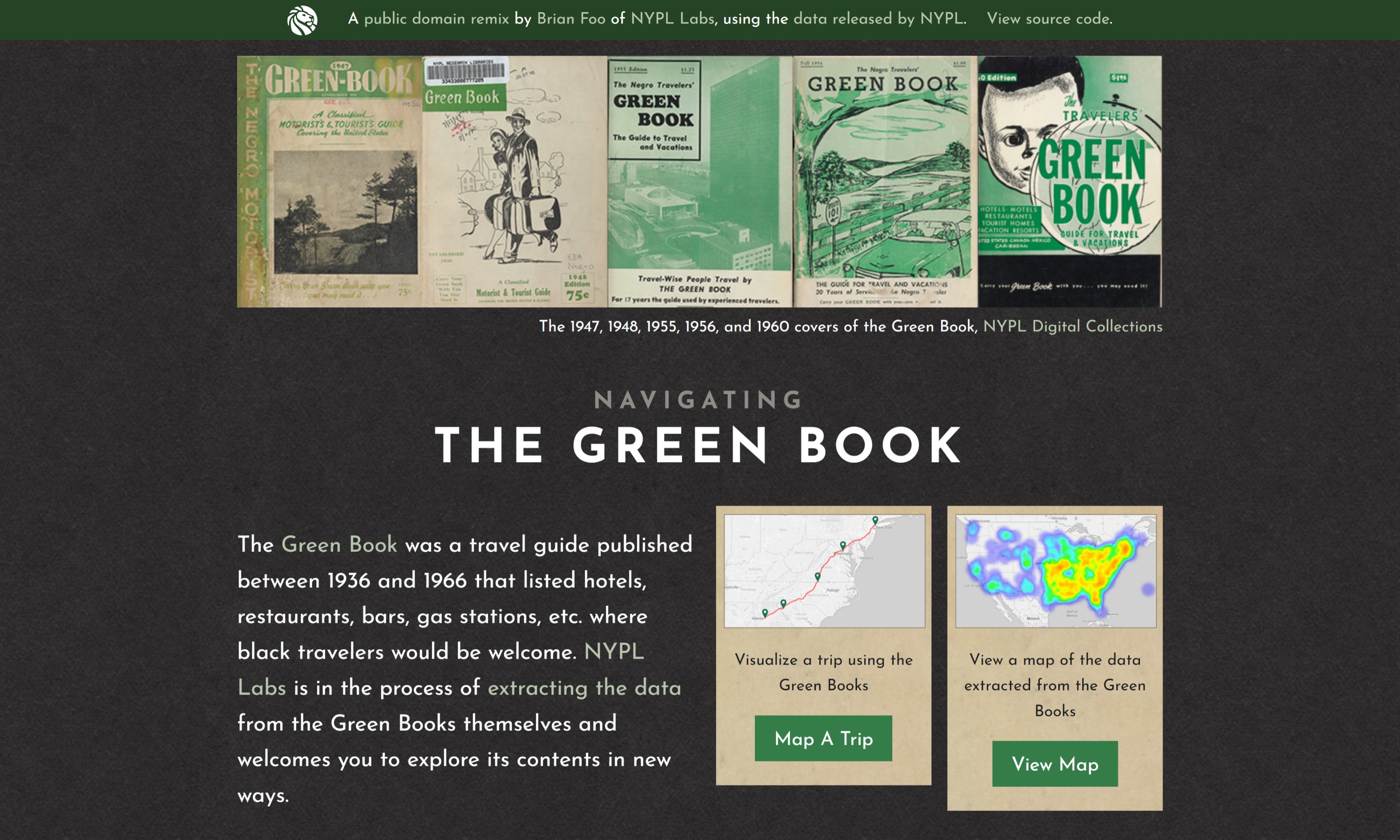
Navigating the Green Book
Project Director(s):
Brian Foo
Project URL:
https://publicdomain.nypl.org/greenbook-map/index.html
Summary
Navigating the Green Book (NGB) aids in the visualization of racial segregation, discrimination, and the civil rights movement. The Green Book was created by Victor Green in a bid to protect Black Americans as they traveled across the United States. It acted as a directory of locations where they were safe and welcome to travel. NGB utilizes Mapbox, Scribe, Leaflet, and Open Street Map to analyze and plot the data contained in the Green Books. The result is an explorable map with routing functionality that allows the user to see, geographically, where Black travelers could go. By offering a new lens through which racial inequity can be viewed, Foo hopes users will critically examine their own lives and how they would be different if they were of another race.
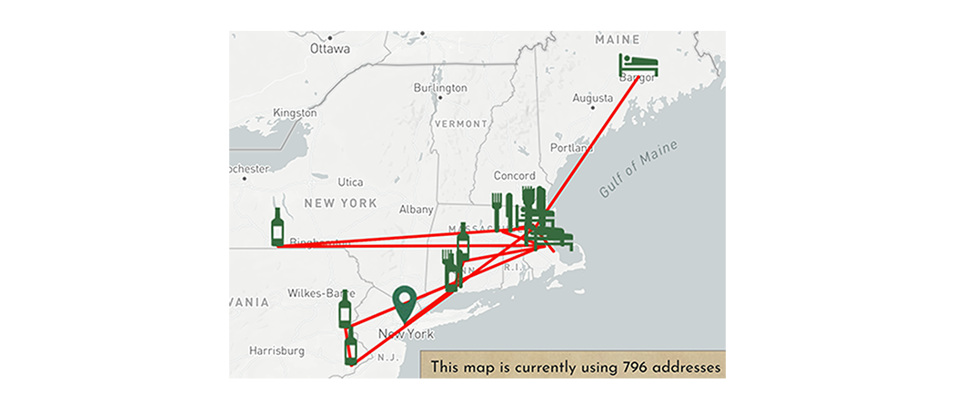
Map Exploration
Upon first viewing the map, I noticed the lack of a legend and key. While the colors and icons present in the cluster map are fairly self explanatory, a key and legend would enhance the usability of the map. I do, however, appreciate the numerical data included within the clusters. It helps the user to visualize where Black Americans were more likely to travel. Admittedly, I was distracted by the individual location icons (hotel, tavern, restaurant) when the map was zoomed out. Instead I would reserve the rendering of icons for when the user begins to zoom in on a specific location. After further inspection, it also appears the icons lack alt text. This is crucial for those with visual impairments, so it is important that this is added in the future.
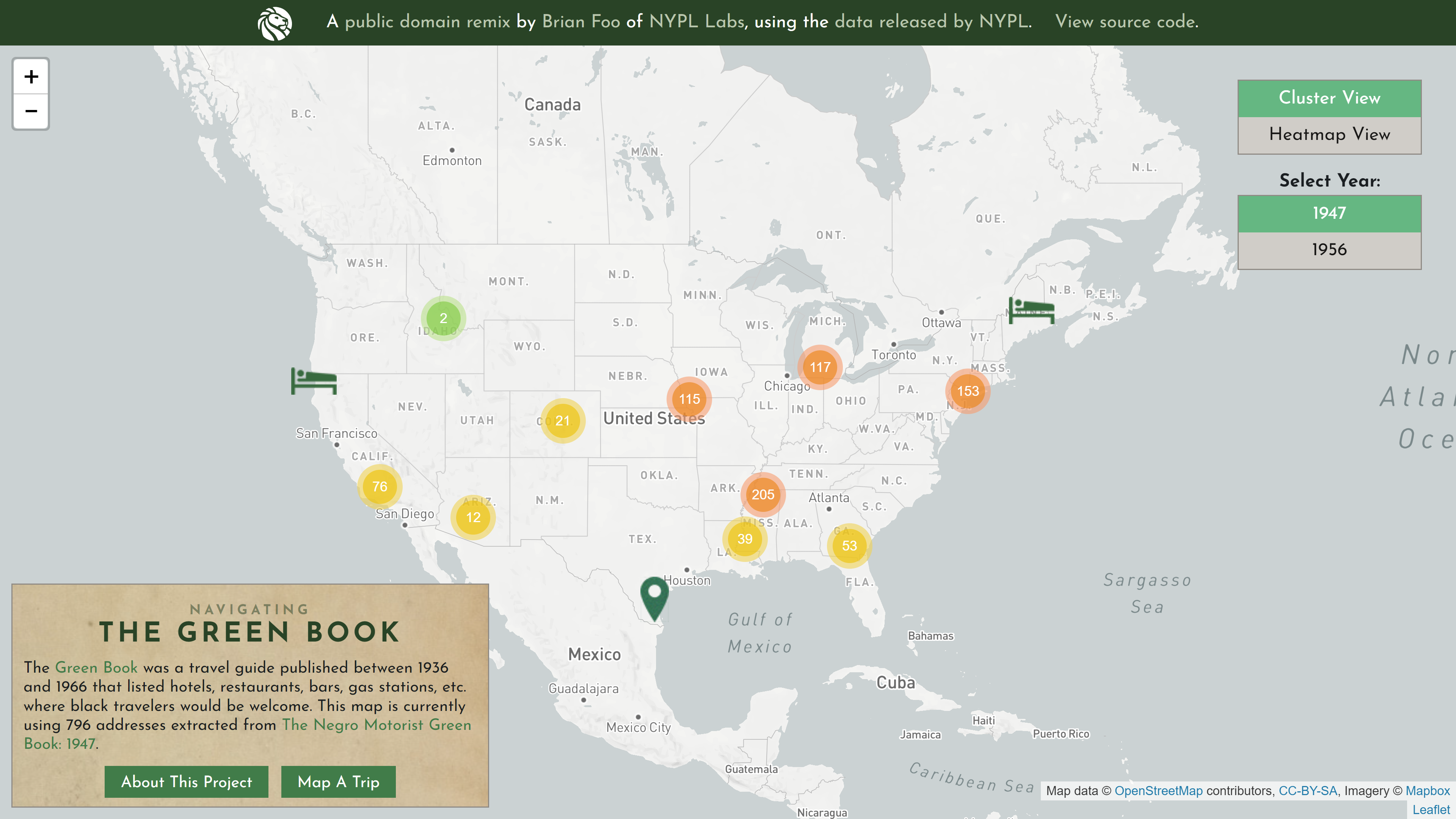
I found it nice that clicking on some icons allowed the viewer to see the supporting documentation directly. I commend NGB for this, as it is important that you are able to do your own research as a user. The NGB team also did an excellent job removing any locations that were generated due to OCR inaccuracies. As I examined the website, I was unable to find a location that I couldn’t reference in the digitized versions of the Green Book.

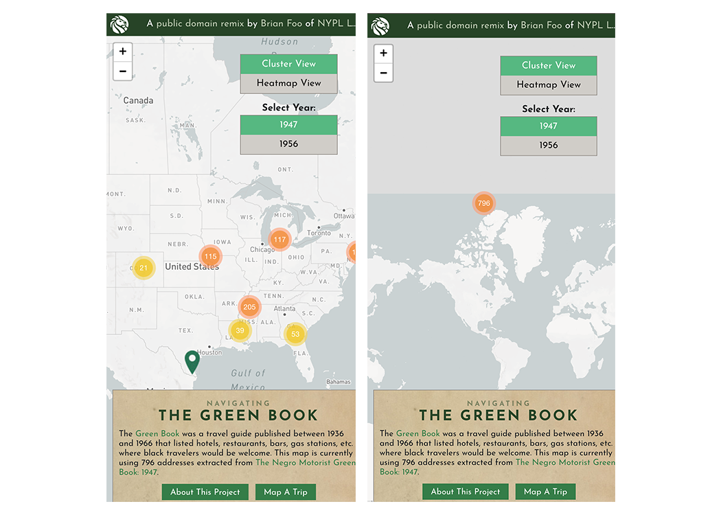
Unfortunately, the website does not share the same appearance across all devices. On the majority of mobile devices, the top banner appears cut off and the bottom block of text describing the map is off center. Though this does not compromise the functionality of the website, it presents the data in a way that is less intutive than its desktop counterpart. On both the desktop and mobile website zooming out causes the data to incorrectly shift upwards. This issue is exaggerated on mobile devices, as it is easy to accidentally zoom out when navigating the website. The developer might solve these issues by implementing a mobile friendly framework and setting a limit on the zoom capabilities.
Trip Planner
The second part of the project involves mapping trips using the curated database of locations from the Green Book. In particular, this feature demonstrates the additional struggle Black Americans had to go through to travel. I’d argue the app achieves its purpose, however it has a few critical shortcomings.
When opening the trip page the user is presented with two input boxes, a box for the starting location and ending destination. The starting location input title has a small typo that reads “Enter an address U.S. address”. Despite minor cosmetic flaws, the app functions well if you enter the start and end locations correctly. Entering addresses incorrectly effectively blocks the user from entering any additional addresses or corrections to the previous incorrect address. Moreover, the exit button in the top left corner is unclickable regardless of the validity of the address.
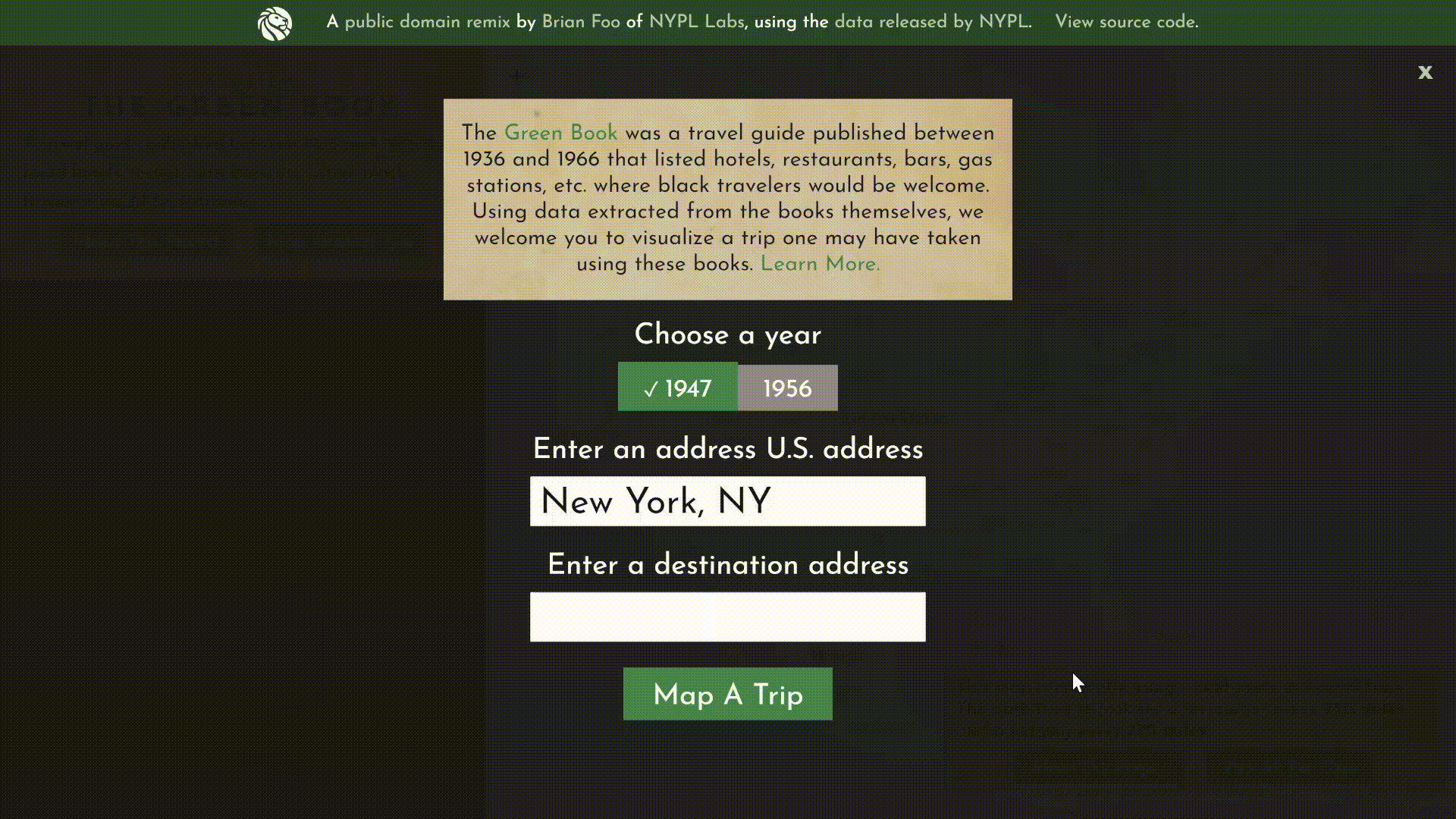
Entering addresses that are outside the United States brings up an error message, but the website proceeds to attempt to map the trip anyway. This leads to a confusing map of crisscrossed lines bounding along the coast. This is especially bewildering for someone that misinterpreted the instructions or failed to realize that the address they were mapping was outside the database of available addresses.
Lastly, I would recommend adding a disclaimer in the box below the mapped trip. The map which the data is plotted on is a recent map and the routes provided are purely for representative purposes. So it is important that the user doesn’t take the trip planner results at face value. It is apparent that the trip algorithm has some edge case scenarios that would yield results that aren’t representative of where an African American would travel to get to their destination.
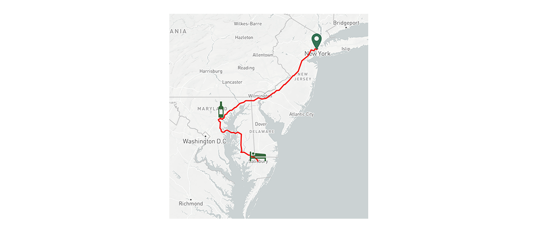
This can be seen in this map of a trip from New York, NY to Newport News, VA. The algorithm places the user at the closest location in the database next to their destination. In this case, the result put the user in Maryland. While this is relatively close to Newport News, it is unlikely African Americans would have traveled this route because they would’ve had to cross the Chesapeake to get to Newport News. Regardless, this functionality offers good insights and presents data from the Green Books in a way that is easily digestible and more substantial than a simple directory.
Conclusion
Overall, NGB presents the information from the Green Books in a new and intuitive way. The project allows users to easily draw conclusions about the effects of the segregation and the civil rights movement.